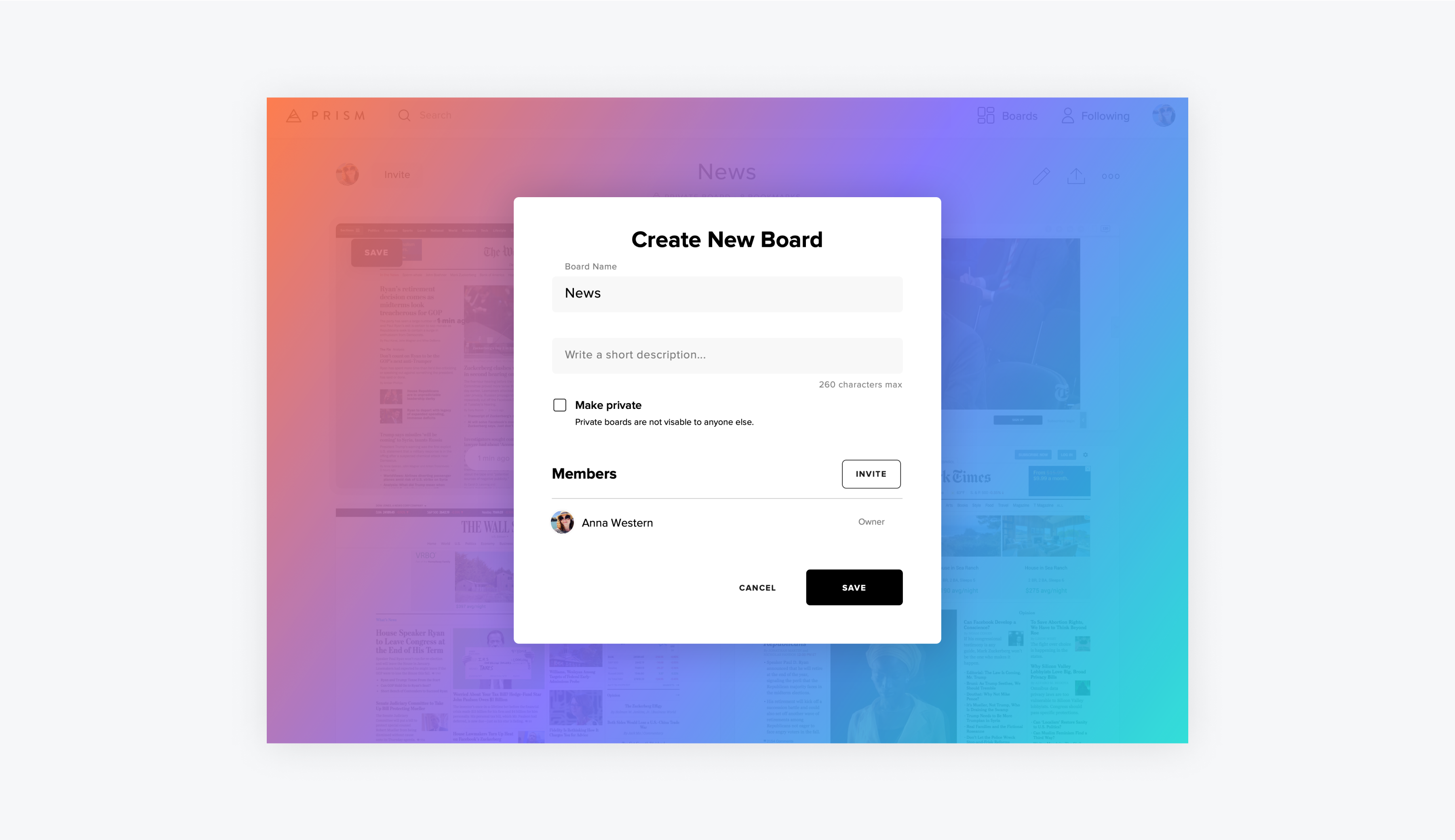
In 2019 I designed, built and launched Prism, a visual website bookmarking tool to make it easier to save, browse and discover websites visually.
Much like Pinterest, but for websites, Prism used up-to-date screenshots to make it easier to browse and revisit your favorite sites. Prism was intended for designers and creatives looking to save design inspiration, do competitive research, shop online or collect design resources, but really was an all-purpose website bookmarking app that made it easier to recall and revisit sites, as well as browse what others have saved.
I began my journey with Prism with a simple design concept. I had never had a good experience with bookmarking and returning to websites despite wanting to, and I wondered what it would look like to see screenshots of sites in a grid to make it easier to browse them all at once. I was doing research for a project and I wanted to compare many sites side-by-side.
Just for fun, I mocked it up and immediately felt like I was seeing the web in a whole new way. I was excited by the idea but I put it in the back of my mind thinking it would be impossible for me to actually build it. I had barely any startup experience and was not an engineer.

Fast forward 6 months and I couldn't get the idea for Prism out of my head. I finally decided to take a risk and share it with an investor friend and to my surprise her response was positive. This started me down the path of actually building Prism.
I started out by doing user interviews and competitive analysis. I had meetings with 20 people and asked them questions about their bookmarking and web browsing behavior.
I ultimately left those conversations convinced that there was a problem here that hadn't been solved for most people. Many people I spoke with said they had used browser bookmarks but never went back to them because the links weren't descriptive enough to jog their memory of what they were, so they just sat there unused.
In researching the landscape of products out there, I found that most solutions only used a link and maybe one image to represent a website. There was one product that had screenshots but it was a paid premium feature, it showed the screenshots too small to be useful and it wasn't fast to use.

After chatting with people in my network I was able to raise a small round of financing and set out to figure out the technical implementation. I ultimately hired a dev agency to build the MVP, which I later would regret. This is ultimately a story of what not to do in building a startup, and I'm more than happy to share my mistakes with others.
Ultimately I was able to build a first version of the product, but not the fully realized version I was intending due to constraints. After 3 months of development, I was able to launch a product that worked and had the essential features of importing your existing Chrome bookmarks, saving a website using a Chrome extension and viewing your sites on a board.
The product was live for about 18 months during which over 4k signed up and saved over 150k bookmarks. Due to lack of funding and technical challenges, I shut down the service in 2020.
Getting to build Prism was one of the biggest challenges and hardest lessons of my career. It almost seems easy when we look at all the beautifully designed and successful products out there. But obviously design and user experience are the tip of the iceberg when building a team and business.
Throughout this process I learned how much I didn't know, not just from a technical standpoint but from the business as well. I certainly was scared out of my mind to try it, but I didn't let that fear stop me from believing in the idea and being willing to find out. In hindsight, I wish I had done things differently, but I'm also proud of what it took for me to go for it and build what I did, which was a beautiful, fully functioning product with a design team of one.


